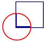
This square and
circle say a lot about journalism.
As journalists we
must always be looking for an original angle on a story while adhering to strict deadlines.
The challenge in
designing this logo was finding something simple that says a lot.
The circle is just
outside the square to show thinking out of the box. It also symbolizes a clock
to show how journalists are always working towards a deadline. The edges of the
square inside the circle represent the hands of a clock (the vertical second hand is thinner than the horizontal hour hand.)
Orange and navy
were chosen because they are slightly different from the standard red and blue colours that we see too often. I also wanted at least one colour in my logo to match my portfolio and résumé
binder.
At first, I wanted
my logo to remind people of my name. After playing with a few designs, I decided that that a name doesn't tell people much
about my abilities. I put the old designs away and started to develop a logo
that could show my abilities as a journalist.
I decided to stick
with this logo since it uses basic shapes and colours and it shows the different aspects of journalism.

